Bestow Marketing Site

Though Bestow’s market is young and internet-savvy, investors grew concerned that the brand was too immature and wasn’t being taken seriously as an up-and-coming major financial tech product.
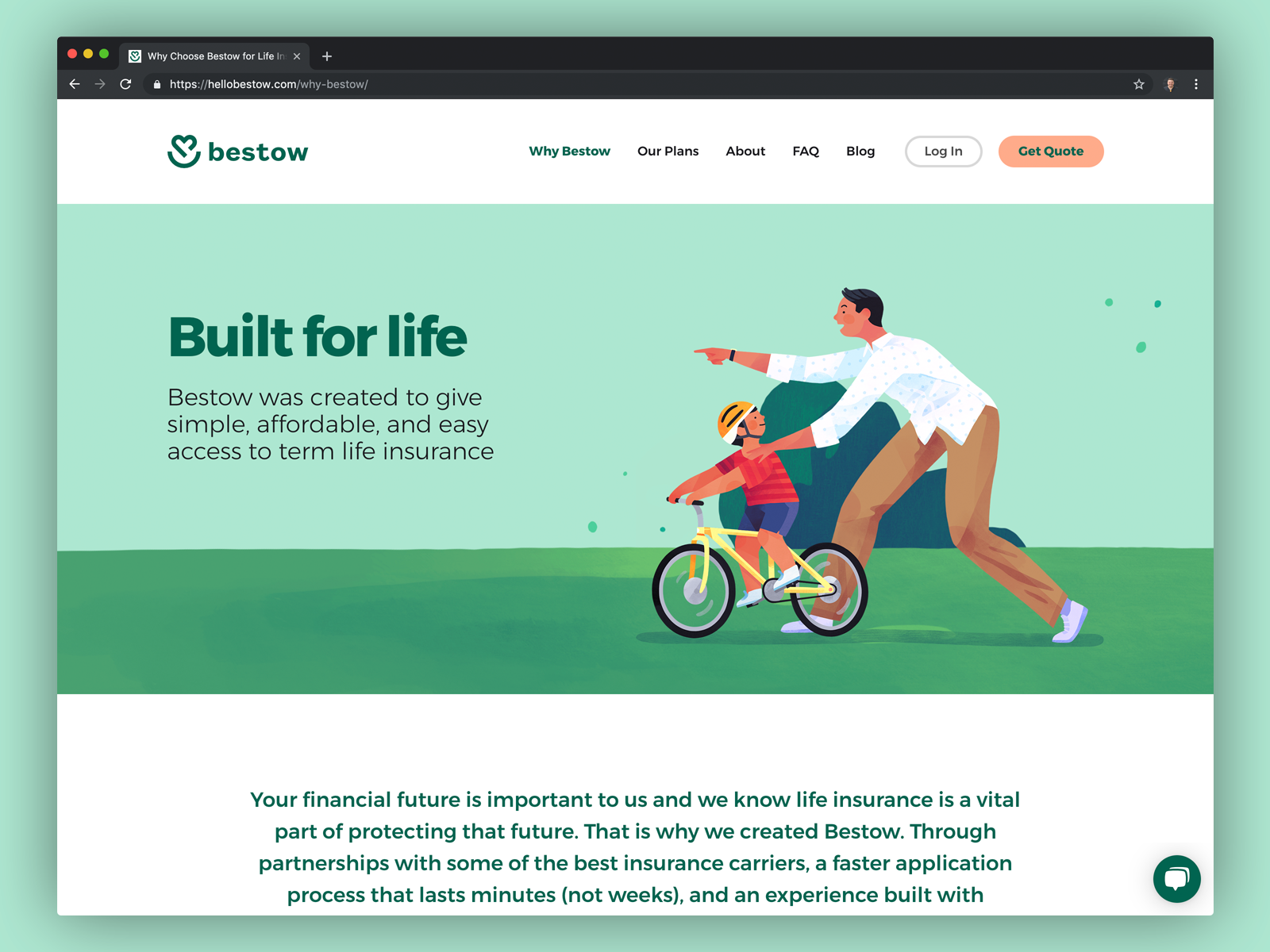
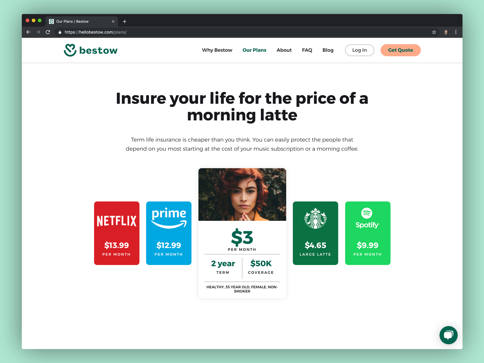
To address investors’ concerns, we pivoted the branding away from cutesy iconography and a color palette of teal, yellow, and orange toward a newly professional but approachable design in forest green and millennial pink.
To coordinate with an external development team, freelance designer, and contract illustrator, we used Abstract to version control the files. That single source of truth helped us work faster and launch the new marketing site on a deadline. Stakeholders were very pleased and excited to pitch the refreshed Bestow brand—a brand more aligned with the vision for the product.
Follow Along
Get the latest posts delivered right to your inbox