Spotify Podcast Inbox

Spotify’s music recommendations are widely regarded as some of the best in the industry, but that hasn’t led to similar success in podcasting. Looking at the metrics for those recommendations revealed abysmal click-through rates. Unfortunately, the consumption patterns are too dissimilar, and to offer better recommendations, our algorithms needed better ways to separate the signal from the noise.
Exploration
Our exploration process began by surveying the competition. Starting with other podcast apps and expanding to video apps like YouTube, Netflix, and TikTok, we contrasted the incentives driving their behavior against our goals. Most podcast apps do very little to recommend content tailored to each user, long-form episodes are harder to evaluate just by reading the description, and short-form video apps want to keep you in their feeds.
Working closely with the team tasked with increasing podcast listening, we audited previous findings from our internal user research group. Spotify has a treasure trove of research into various user personas, their feedback on the experience, and their revealed preferences from measured behavior.
After watching several user interviews, it became apparent that users had very little ability to “teach” the algorithm anything about their podcast preferences. By and large, users don’t make playlists of episodes to revisit or recommend to friends. They can’t exclude individual episodes from their Taste Profile. Even following a podcast wasn’t a strong indicator that they’d listen to every episode.
We decided to focus our attention on a narrow aspect of the larger problem: Can we improve the episode recommendations from the shows the user is following?
Process
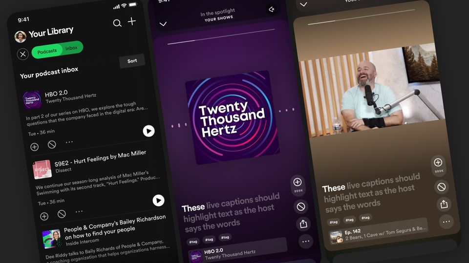
We eventually arrived at a “podcast inbox” concept as we evaluated several potential solutions. Creating a dedicated place for users to triage the influx of new episodes from their shows would give us the feedback we need to improve our recommendations. I started creating several high-fidelity prototypes to help pitch the idea and gather internal feedback.
Podcast episode cards on Spotify usually encourage users to immediately hit play or add it to a special “Your Episodes” playlist. Given that the inbox is populated from the user’s followed shows, adding a dismiss action would be invaluable to honing their recommendations. Defaulting the sorting of this inbox to “Most recommended” (rather than by date) would help users recognize the value of training the algorithm to their tastes.
While users might be familiar with swipeable cards from their email clients or apps like Tinder, it would be a new paradigm for the Spotify app. The swiping feature didn’t significantly affect the experiment's outcome, so we decided against onboarding overlays and instead included buttons with redundant functionality.
Given the resources available to us, this experiment felt sufficiently ambitious. Still, as we solicited additional internal feedback, we were encouraged to go further and take advantage of existing technology to transcribe episodes and pinpoint key moments for clips. Leveraging that ability lead to an entirely new user interface for the experience.
With each iteration, we recognized the pressure toward the inescapable design pattern of the last few years: a TikTok-style feed. For the sake of the experiment, the benefits of a familiar user experience outweighed the concerns of mimicking a feed with very different content and incentives. While others want to keep you in the feed, we want to use the limited time with Spotify in the foreground to queue up background listening. Ultimately, the industry has converged on this format as the most effective way to evaluate new content.
Conclusion
Unfortunately, extenuating circumstances prevented us from launching this to the broader user base, but many of the ideas put into this experiment were eventually incorporated into the redesign of the Home page presented on stage at Stream On 2023:
Follow Along
Get the latest posts delivered right to your inbox